SwiftUI Reusable Button Style
swift swiftui ios buttons
Your users experience within your application is very important when it comes to building a mobile application. If your users can’t enjoy using the application, it is highly likely that they will not return. Having a uniform look and feel across your application helps build that user experience and SwiftUI makes it easy for us to create reusable button styles. Couple that with custom buttons and it makes things even easier!
Building the Button
First things first, we’re going to build our reusable button. For this case, we’re going to create one that has three parameters that allow us to use an icon, title, and then has an action. Both the icon and the title are going to be a String as in this example we’re going to focus on the use of SF Symbols.
struct CustomButtonView: View {
    let text: String
    let icon: String
    var action: (() -> Void)

    var body: some View {
        Button(action: action) {
            HStack {
                Image(systemName: icon)
                Text(text)
            }
        }
    }
}
As you can see, it’s a nice and simple view in which we define the parameters, and use a closure for our action so we can define what our action is at the time of use.
Make it Custom
Now we can create the custom button style in which we’ll use as a view modifier, much like we would with any other view to the above CustomButtonView which will allow us to just call that view when we need it and all of our buttons will look the same for uniformity.
struct CustomButtonStyle: ViewModifier {
    func body(content: Content) -> some View {
        content
            .padding()
            .background {
                RoundedRectangle(cornerRadius: 12)
                    .foregroundStyle(.bar)
            }
    }
}
In this simple example, we’re going to just add some padding to the content of the view itself which happens to be our HStack contents. Then we’ll add a background that will be a RoundedRectangle with some color. Now to allow us to use it within our parent view, we’ll create an extension of View to allow us to build this very nice use method we’re all familiar with.
extension View {
    func customButtonStyle(color: Color) -> some View {
        ModifiedContent(
            content: self,
            modifier: CustomButtonStyle()
        )
    }
}
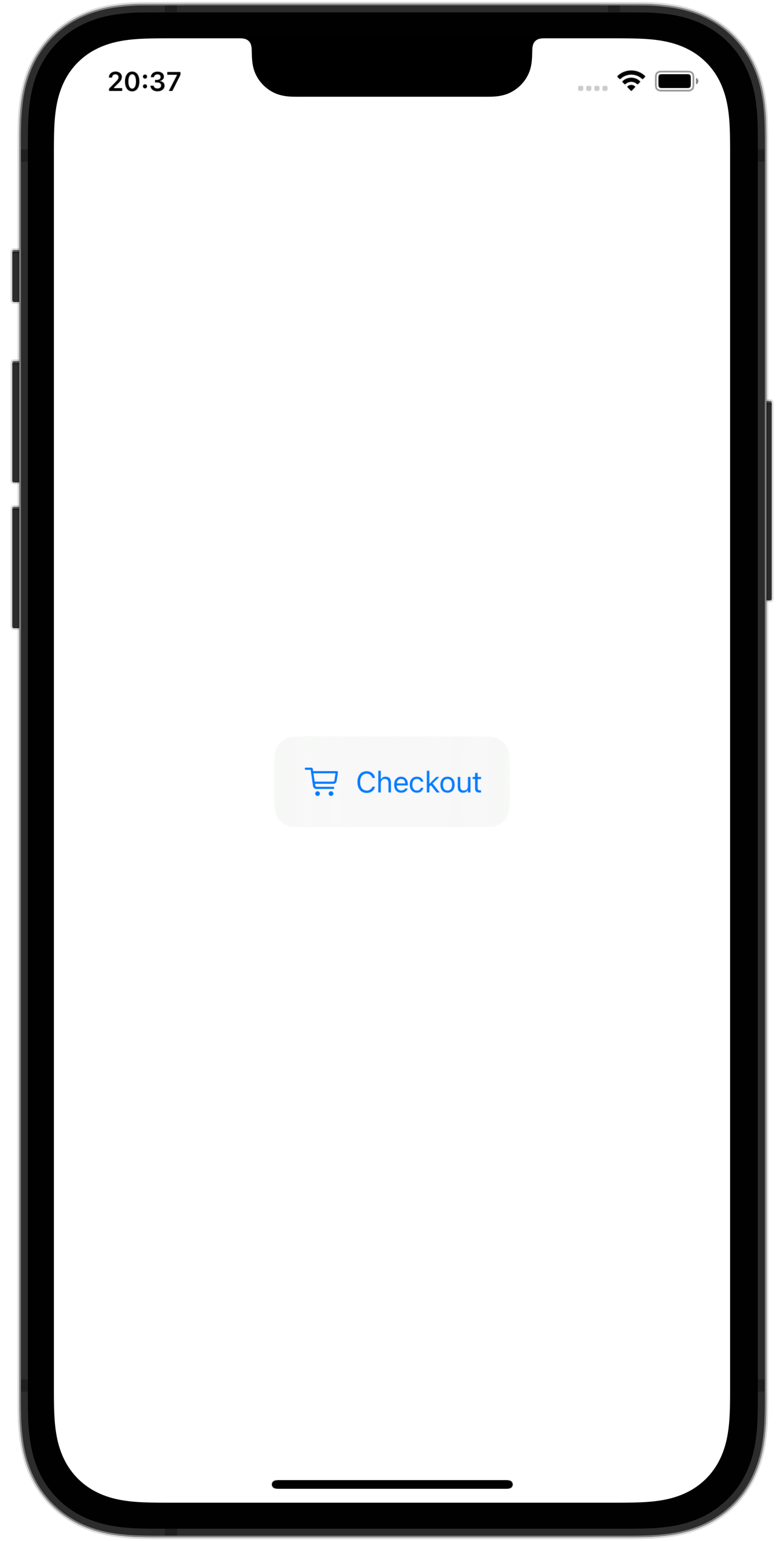
See it in action
Now that we have all the pieces of the puzzle together, we’ll be able to simply call .customButtonStyle() as a modifier on our button which will apply our new style.
struct CustomButtonView: View {
    let text: String
    let icon: String
    var action: (() -> Void)

    var body: some View {
        Button(action: action) {
            HStack {
                Image(systemName: icon)
                Text(text)
            }
        }
        .customButtonStyle(color: .blue)
    }
}
Then to put things into action on our views we want to use our buttons, we’ll simply call it like we would any other view.
struct ContentView: View {
    var body: some View {
        VStack {
            CustomButtonView(
                text: "Custom Button",
                icon: "plus") {
                    // Do something incredible!
                }
        }
    }
}
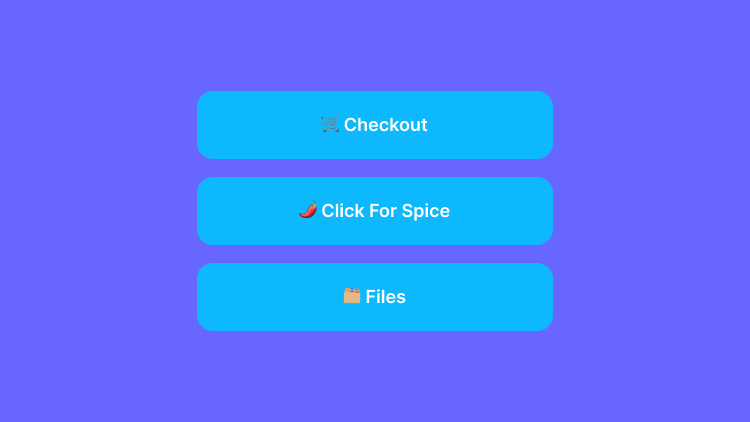
Lets make it spicy 🌶️
Who doesn’t love a little spice in their life right? So in this example I show how you can add some parameters to make it even more custom. By adding these variables, each instance we call our new button view, it will require us to pass in parameters.
struct CustomButtonView: View {
    let text: String
    let icon: String
    let backgroundColor: Color
    let foregroundColor: Color

    var action: (() -> Void)

    var body: some View {
        Button(action: action) {
            HStack {
                Image(systemName: icon)
                Text(text)
            }
        }
        .customButtonStyle(backgroundColor: backgroundColor, foregroundColor: foregroundColor)
    }
}

struct CustomButtonStyle: ViewModifier {
    let fancyBackgroundColor: Color
    let fancyForegroundColor: Color
    func body(content: Content) -> some View {
        content
            .padding()
            .foregroundStyle(fancyForegroundColor)
            .background {
                RoundedRectangle(cornerRadius: 12)
                    .foregroundStyle(fancyBackgroundColor)
            }
    }
}

extension View {
    func customButtonStyle(backgroundColor: Color, foregroundColor: Color) -> some View {
        ModifiedContent(
            content: self,
            modifier: CustomButtonStyle(fancyBackgroundColor: backgroundColor, fancyForegroundColor: foregroundColor)
        )
    }
}
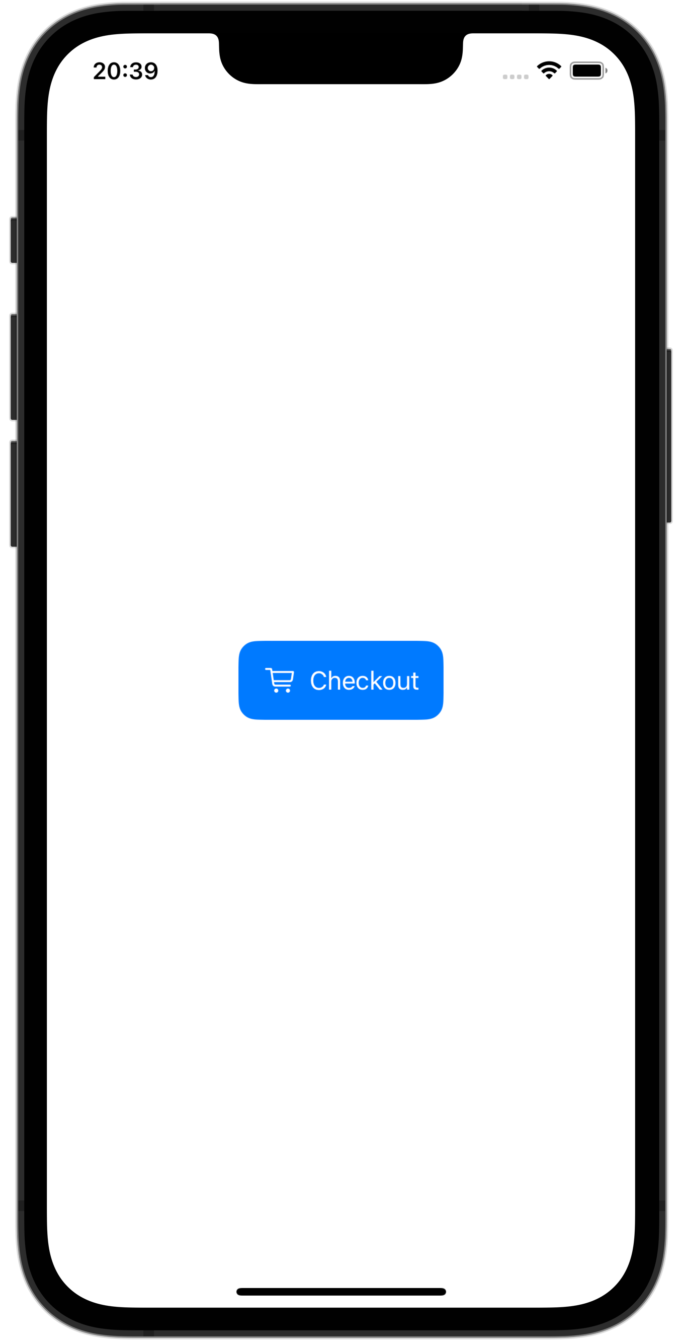
Now to use our custom button its just as simple as this!
struct ContentView: View {
    var body: some View {
        VStack {
            CustomButtonView(
                text: "Checkout",
                icon: "cart",
                backgroundColor: .blue,
                foregroundColor: .white) {
                // Do something amazing!
            }
        }
    }
}