SwiftUI Dividers
swift swiftui ios ui
A divider in SwiftUI is an easy and concise way to help separate content within a view. In this brief article, I will show you how easy it is, as well as a few use cases.

What is a Divider?
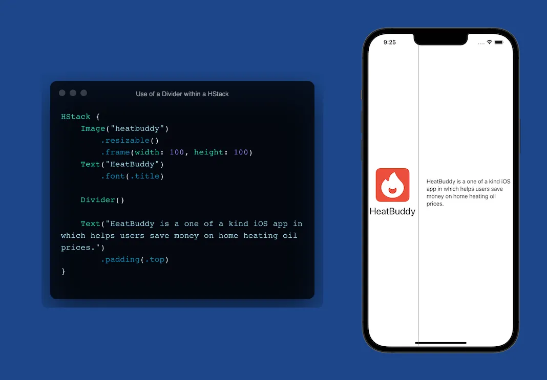
A divider helps us break up content clearly and simply. It is a simple thin grey line that can be displayed either horizontally or vertically. Unfortunately, dividers can be pretty limited in their use however, customization is still possible.

What’s the difference between using a divider in a VStack vs an HStack?
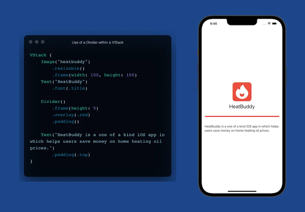
Using a divider in a VStack will yield a horizontal line spanning the entire axis, as shown above. When using a divider within an HStack, it will yield a vertical line spanning the entire axis, as shown below. Both have their use case however they can still be customized to fit the need of your design.

Customization of a Divider
While dividers are simple and easy to use, they do have their limitations and quirks. Let’s say you want to add thickness to the divider. We have to use the appropriate .frame() modifier based on what type of stack it is in. If we’re inside of a VStack then we must use .frame(height: 5) while if we’re in an HStack, we will use the .frame(width: 5) modifier.
Upon initial use, you will notice that the divider will span the entire axis from edge to edge. Instead of hard-coding some sort of width on it, we can simply add .padding() to bring it in from the edges a bit.
Looking to add some color?
To do this, we’ll need to use the .overlay modifier and pass in our color such as .overlay(.red) which will change the color to red. To see all three of these modifications in action, check out the image below!

In conclusion, you can see that while there are some limitations to how we can customize it. The divider gives us a nice and simple way to separate content without having to use paths or make a really thin rectangle which, if I’m being honest — early on I did this!